Two disciplines. One creative space. Ideas that overflow.
Exploring the intersection of design and development through a distinctive visual identity built around duality, curiosity, and creative experimentation.
Creating an identity that could bring two different creative disciplines into one world.
Gemini Overflow began with a simple idea: design and development don’t have to exist separately.
The name combines the idea of Gemini — duality, two perspectives, curiosity, and communication — with “Overflow,” inspired by the culture of sharing knowledge and solving problems.
The challenge was to translate that idea into an identity that felt intelligent and technical without becoming cold, and creative without becoming overly decorative.
Concept
Two → One → Overflow.
The identity is built around the relationship between two sides.
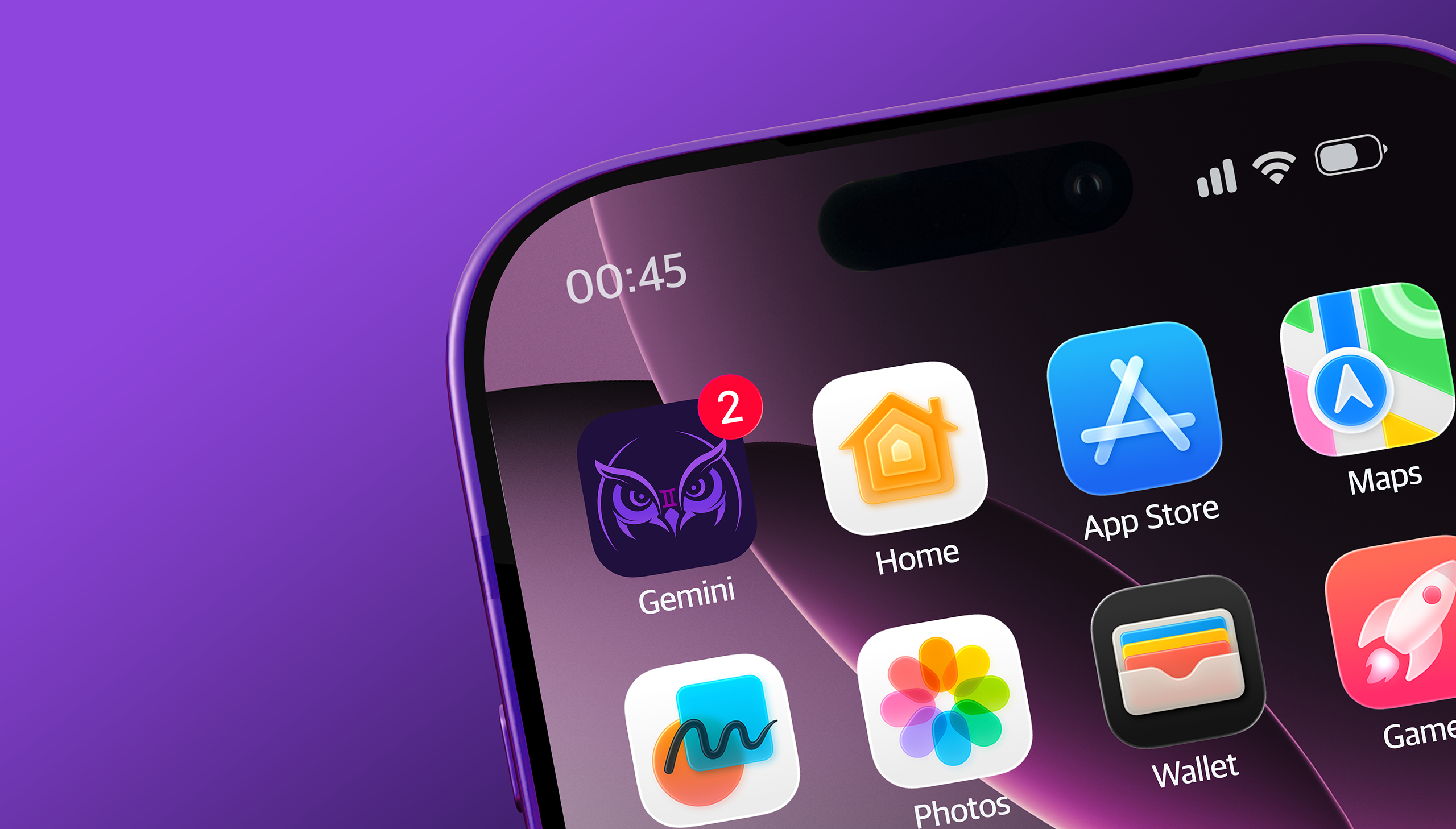
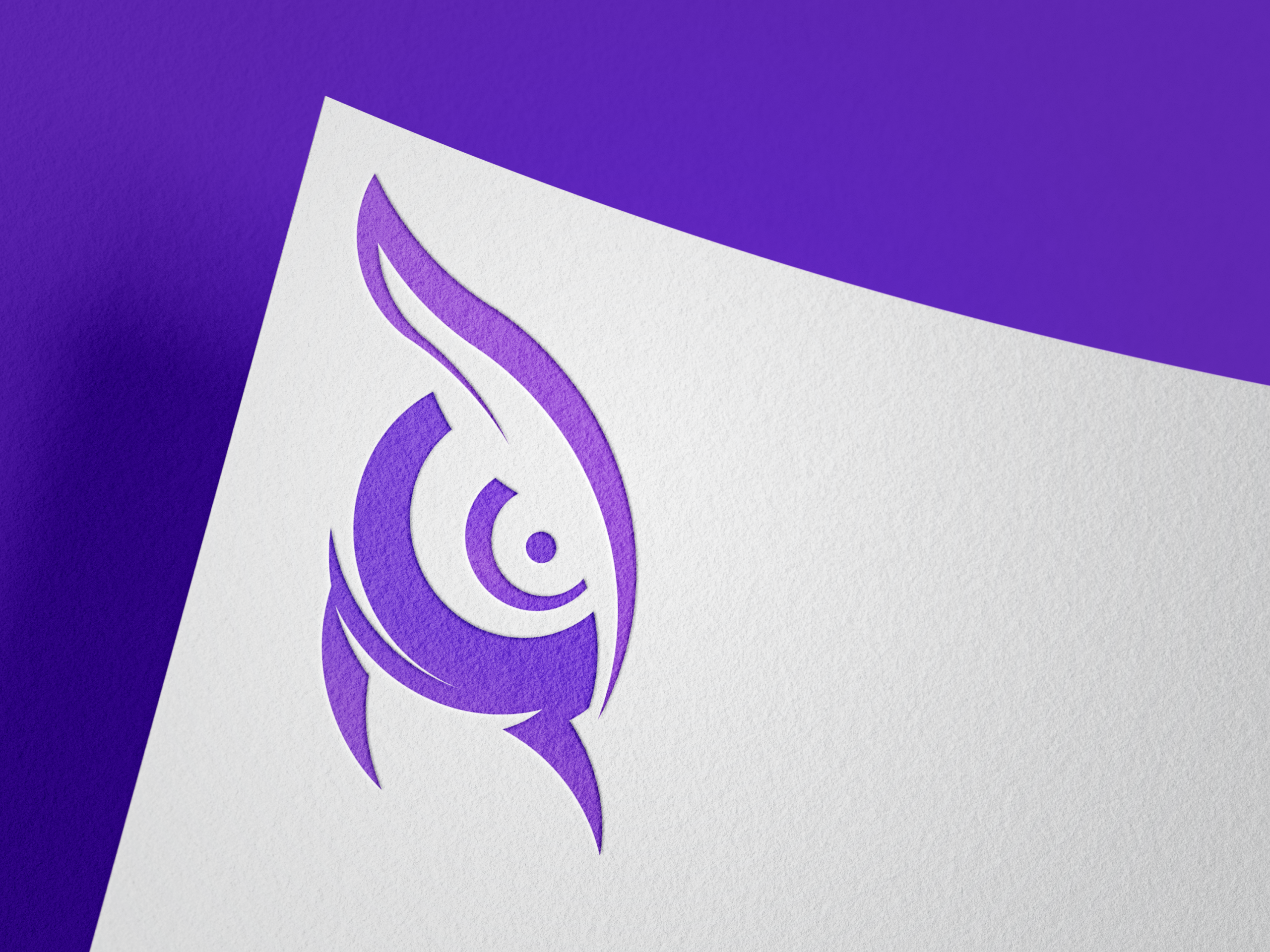
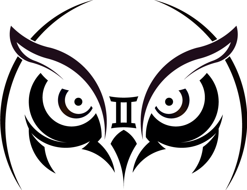
Design and development represent the two disciplines, while the Gemini concept gives that relationship a deeper meaning. The visual identity explores symmetry, mirrored forms, the owl as a symbol of knowledge and observation, and technological details inspired by circuitry.
The two sides come together to form something greater than either one individually — and what emerges from that interaction is the overflow.
Identity
A visual system built around duality, curiosity, and experimentation.
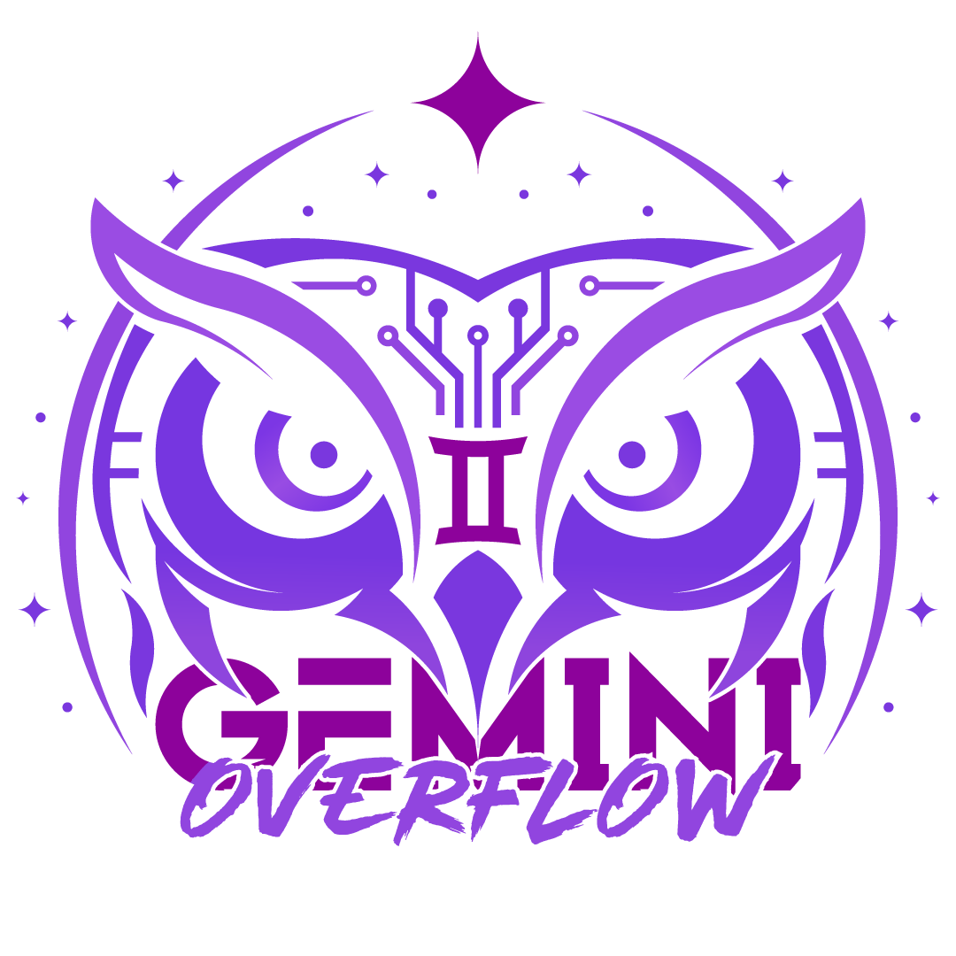
The primary logo combines two owl forms into a single symmetrical symbol, creating a visual representation of Gemini’s duality. The central Gemini mark connects the two sides, while circuitry, stars, and flowing forms introduce ideas of technology, discovery, and expansion.
From the primary logo, a wider identity system was developed through secondary marks, patterns, typography, backgrounds, and graphic elements that can evolve across different applications.
Shaping comprehensive brand narratives for enduring impact.
Shaping comprehensive brand narratives for enduring impact.